


Tracing, Walking, Meandering

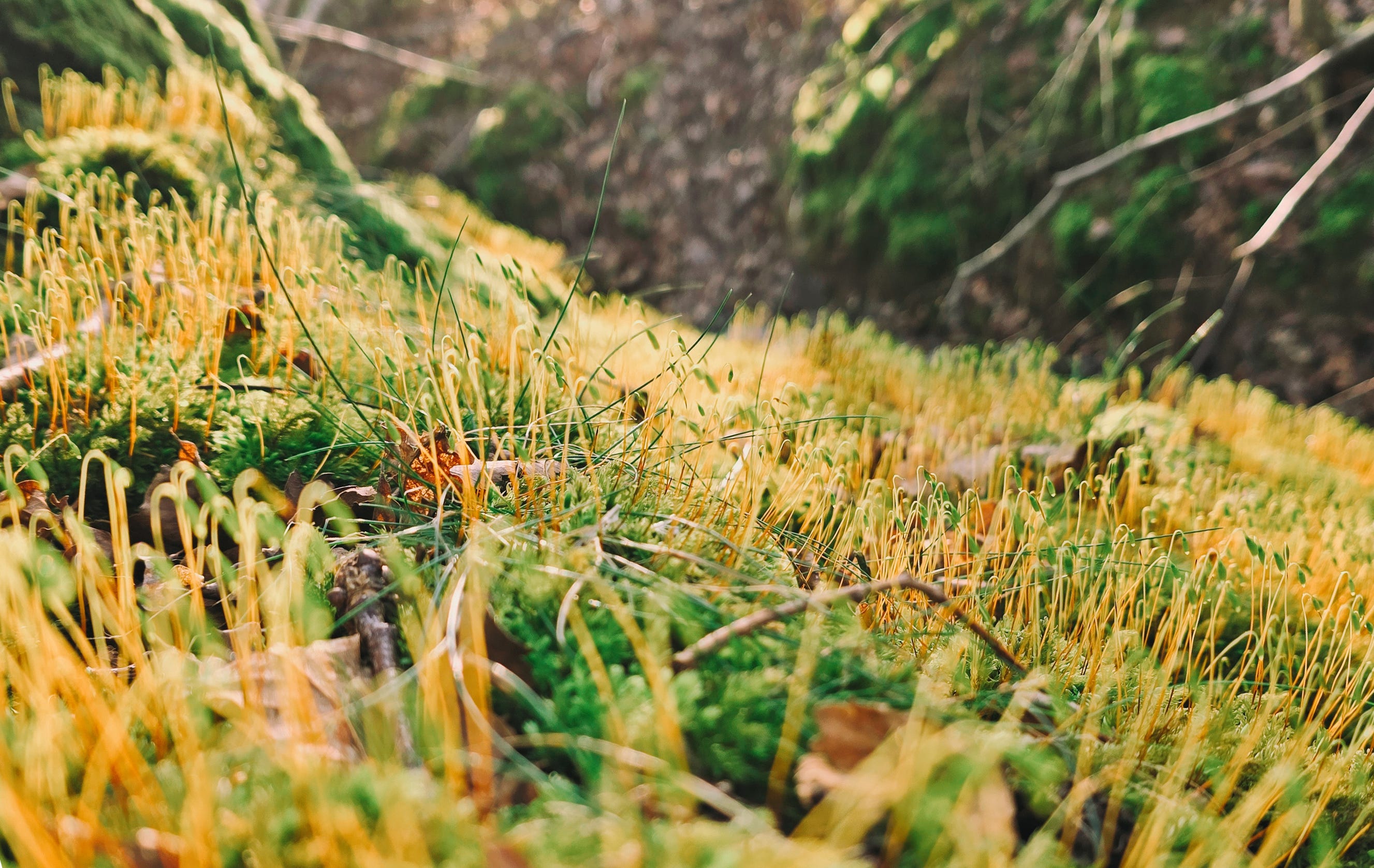
Spring is almost here, finally, after a winter of endless rain. The forest floor is cushioned with moss in every shade of green. Patches after patches, stretched out their long, slender setae, ready to release spores.
I found a small gathering of scarlet elfcups, bright and delicate on a fallen twig. Their colour and shape seem almost surreal—no wonder folklore claims fairies bathe in them! A magical addition to my mushroom finds!

Last month I created a series of spot illustrations for The Telegraph Travel and Inntravel UK for a walking holiday advertisement.
I’ve worked with The Telegraph quite a few times over the past two years, mostly on maps. The process were similar—selecting elements to represent a place—but the choices needed to align with the client’s business.
I love the research that comes with this kind of work—learning about places that are sometimes familiar and sometimes unknown. I like to represent each location using small details to bring out its textures of life.
Although this time was not a map, the process was much the same. It was all about walking, through landscapes, through time. Following nature, the worn places, the trails that have held footsteps for centuries. I wanted the illustrations to reflect the theme and to feel earthy and a bit nostalgic rather than a sleek, modern hiking vibe.
Here’s the list of what I drew and my draft:
Hiking boots
A German trilby hat
Walking sticks
A backpack
Birds
Bird’s footprint
A whistle
A compass
A camera
A water bottle

And for the section headings:
Puffin, edelweiss, gentian
The Camino de Santiago with Compostela Cathedral
Pintxo, white asparagus, chanterelle and penny bun mushrooms (apparently I was extra excited drawing this one😉)

Initially I only decided on green, yellow, and brown to keep the palette earthy and nostalgic. But that morning, as I sat down to colour the illustrations, I glanced at my laptop login wallpaper—a still from one of my favourite films, Moonrise Kingdom, which I’ve had since college. On a whim, I decided to sneak in a touch of pink into the white parts of objects, adding a bit of playfulness and a more relaxed feel.
The art director also requested a simple made up topographic map as a background. A simple outline would have worked, but as I shaped it I started to see a shoe’s outsole—so I leaned in, now it’s both!

It’s a blessing to be able to draw the things I love for work! While illustrating these little delights, I kept thinking about all the walks and travels I’ve had in nature over the past year. As the days in London are stretching out—slowly but surely—I’m already looking forward to the time I’ll spend meandering through the outdoors this year.
Have you thought about your plans for the months ahead? If you also love hiking and nature, I hope these small illustrations spark a bit of excitement for whatever outdoor adventures await you this year.
Before wrapping up, a quick work update:
Apart from a few short-term projects, I’ll be starting the final art next month for a picture book set to publish in June. Fingers crossed everything goes smoothly! And another book project I contributed to—one that began in 2020—was finally printed and bound this month. I can’t wait to share more soon, stay tuned!
Okay—until next time, enjoy the lengthening days, the kinder weather, and whatever small wonders find their way into your days!

在綿延的冬雨之後,春天終於快要來了。
森林的地面鋪滿了蓬軟的苔蘚,一片一片不同深淺的綠色延展開來,細長的蒴柄伸向空氣準備釋放孢子。我在落葉間的一根樹枝上發現了一小群緋紅肉杯菌。它們的顏色和形狀像是不屬於這個世界的神奇,難怪歐洲的民間傳說裡,精靈會用這種蘑菇當澡盆、喝露水(英文俗名elfcup直譯就是精靈杯)。又發現了一種沒看過的蘑菇!
上個月,我為 The Telegraph Travel 和 Inntravel UK 創作了一組徒步旅行廣告的插畫。
過去兩年,我和The Telegraph合作過很多次,大多是繪製旅行廣告的地圖。過程大致上都相似,選擇能代表一個地方的元素。當然這些選擇需要與客戶的業務和推廣內容契合。我很喜歡這類工作的研究過程,可以進一步認識那些我熟悉或完全陌生的地方。在選擇的時候,我喜歡用小細節、小物件來呈現一個地方的生活氣息,去代表那個地方。
這次雖然不是畫地圖,但過程類似。主題是關於走路旅行,在風景和時間之中。跟隨大自然,沿著那些被無數腳步踏過的古道和被時間磨蝕的建築。我希望插畫能夠呼應主題,帶有大地氣息也帶點懷舊感,而不是現代的登山風格。
下面是我選擇的元素和草圖:
登山鞋
巴伐利亞獵帽(Trilby Hat)
登山杖
背包
鳥腳印
鳥
指南針
口哨
相機
水壺
以及用於不同段落標題的插圖:
海鸚、火絨草(小白花)、龍膽花
聖地亞哥朝聖之路和聖地亞哥德孔波斯特拉主教座堂
Pintxo牙籤小吃、白蘆筍、雞油菌和牛肝菌(畫這個時候特別開心 😉)
一開始我只打算用綠色、黃色和棕色來讓插圖保有自然懷舊的感覺。但在準備上色的那天早上,我看著筆電登入畫面的背景,那張我從大學用到現在《月昇王國 Moonrise Kingdom》的劇照,我決定再加入一些粉色,在物件的白色部分裡,讓畫面多一點輕鬆俏皮的感覺。
AD也有要求為背景製作一張簡單的虛構登山地圖。一開始我畫了一個普通的輪廓,但越畫越覺得它看起來有點像鞋底紋路,於是我便順勢讓它既是一張地圖,也是一個鞋印了!
能在工作上盡情地畫喜歡的事物太幸福!在畫這些小物件的時候,我不停地想起過去一年在森林裡的漫步和旅行。隨著倫敦的白天在緩慢但穩定地逐漸延長,我已經很期待今年會待在戶外的時間了。你呢,接下來幾個月有沒有放假的計劃呢?如果你也熱愛徒步和大自然,希望這些小插圖能為你今年的任何戶外活動帶來一點期待!
在結束前分享一些近況:
除了正在完成一些短期項目外,下個月(明天)開始就要著手一本繪本的完稿插畫了,預計六月會出版。 希望一切順利;另一個我從 2020 年開始參與合作的書,終於在這個月完成印刷和裝訂了! 等不及待想與你們分享更多細節,敬請期待!
最後,我想這會是最後一次有中文的電子報。謝謝你一直以來的閱讀,但因為時間和每一封信的版面關係,未來的內容沒意外的話,就只會有英文版了!但是但是,現在各種翻譯軟體功能都很厲害,歡迎直接複製翻譯。如果有什麼想法或建議,也歡迎留言或直接回覆這封email~
好啦!直到下次收信前,希望你享受這逐漸拉長的日光,越來越開朗的天氣,以及任何出現在你日常裡的小幸福!